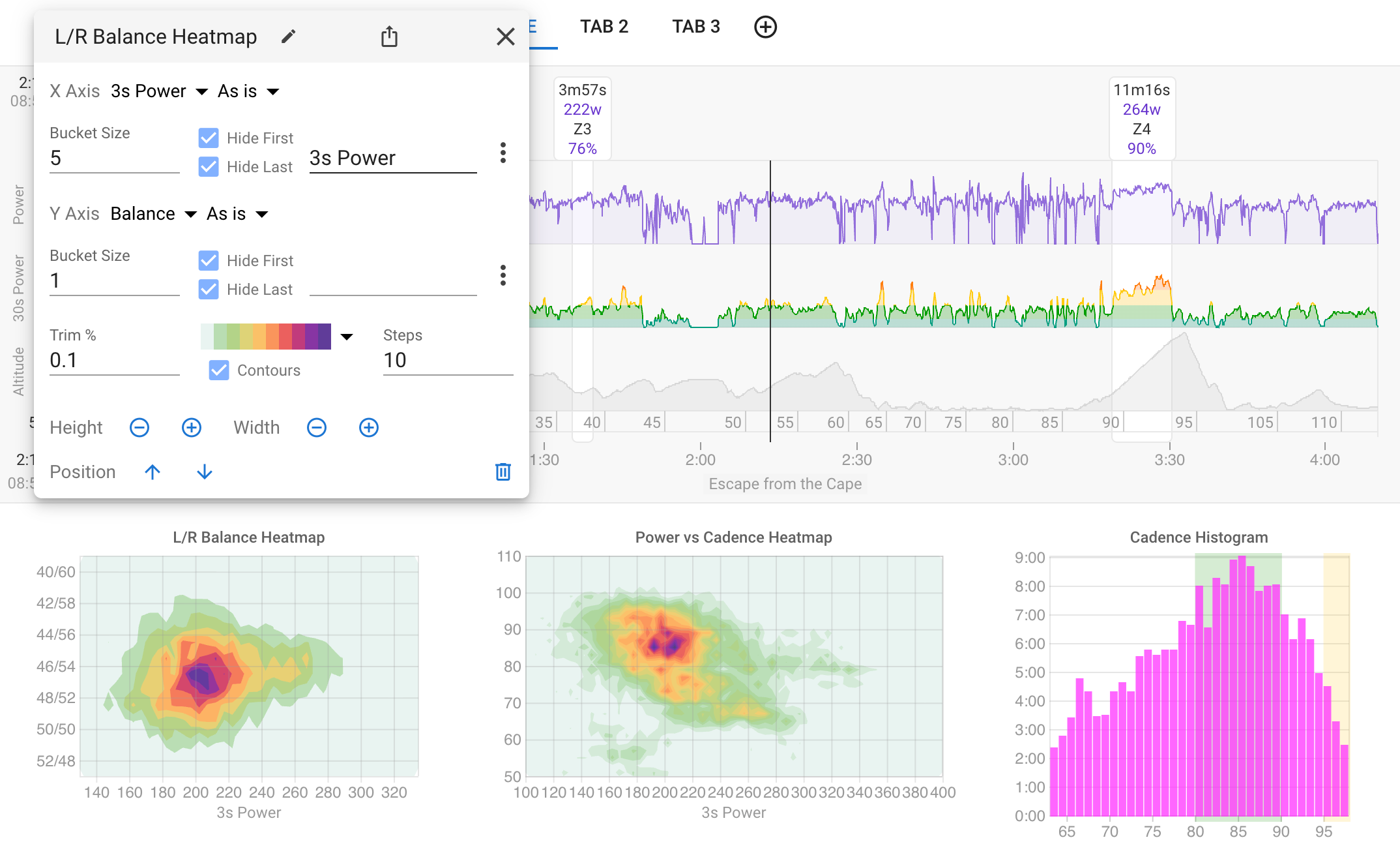
Heatmaps & Histograms
Visualize activity data density with heatmaps and histograms. Pick any two streams for the axes, set bucket sizes, and see where you spend the most time. No coding required.
See Your Data in a New Light
Heatmaps and histograms give you a visual picture of where you spend the most time during an activity. Darker areas mean more time at that combination of metrics.
- Two-dimensional heatmaps for any pair of activity streams
- Histograms for single-stream distribution analysis
- Power, pace, heart rate, cadence, stride length, L/R balance and more
- Configurable bucket sizes and axis labels
- Set min/max values and trim percentages to filter outliers
- Syncs with the activity timeline to show data for the visible portion
- No JavaScript coding required
More in Analyze Your Activities
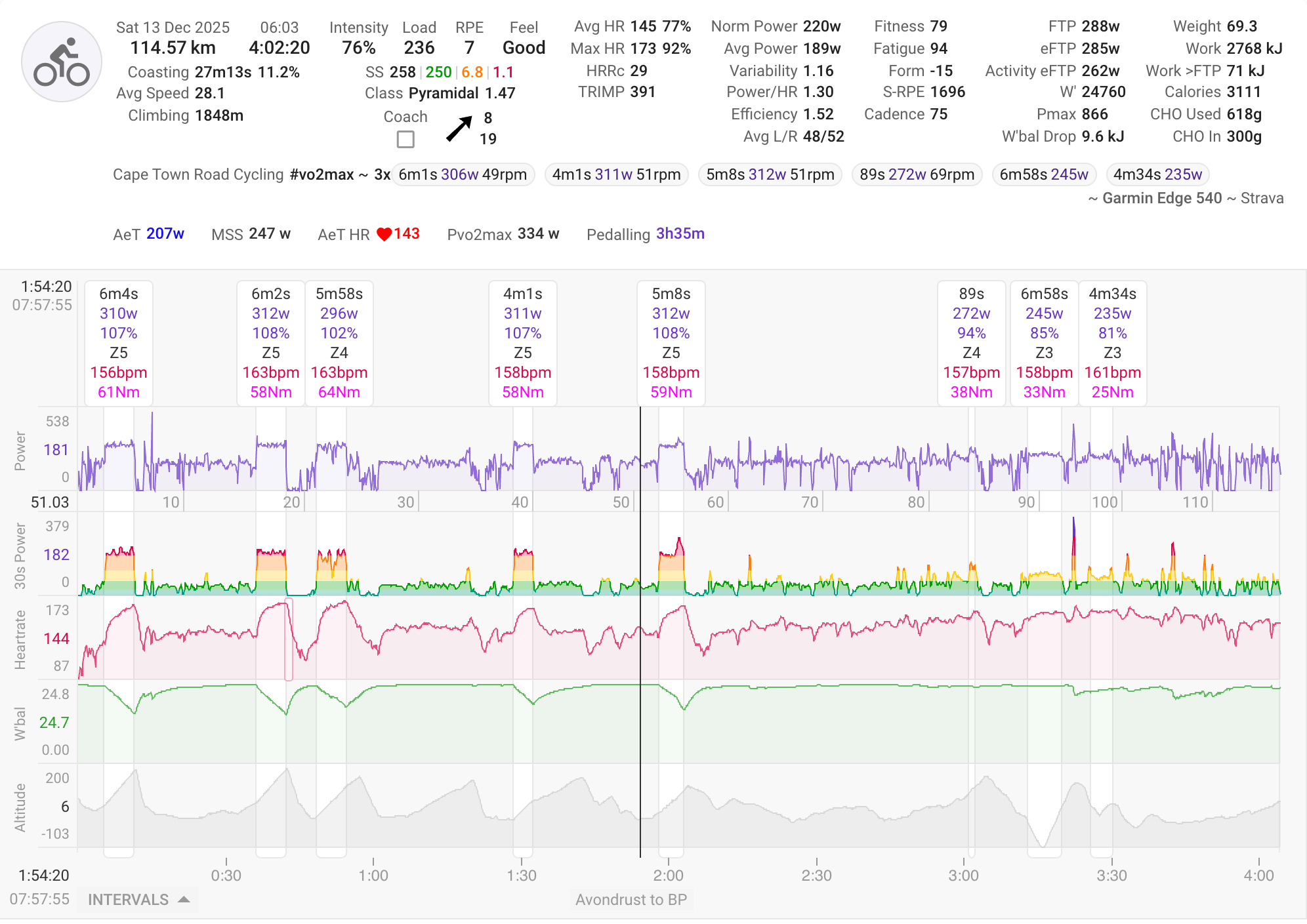
Activity Timeline
View your activity with Coggan metrics plus unique Intervals.icu metrics. Automatic interval detection finds your efforts, with spike detection and correction for power and HR data.
Learn more →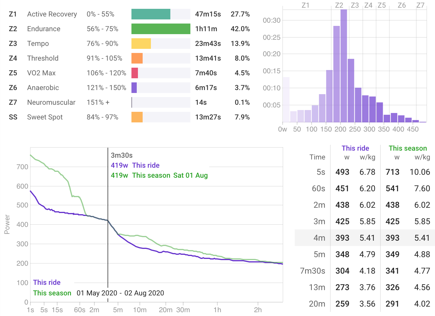
Power Charts
Analyze zone time distribution, view your 42-day power curve, histograms, and best efforts all within the context of a single activity.
Learn more →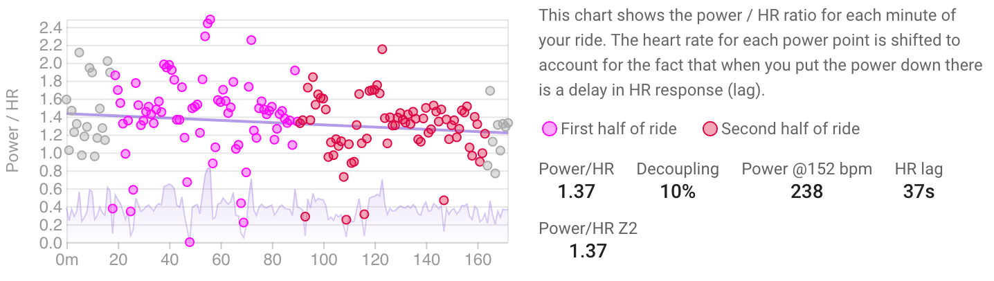
Decoupling
Track your aerobic fitness through cardiac drift analysis. The Power/HR Z2 metric provides a clear picture of your aerobic efficiency over time.
Learn more →