Analyze Your Activities
Deep-dive into every ride, run, and swim with advanced interval detection and metrics.
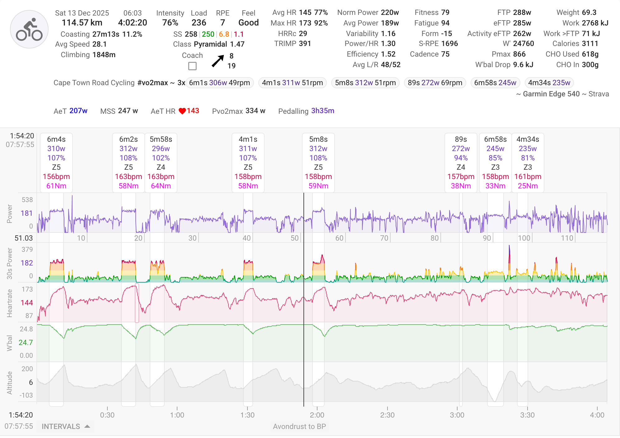
Activity Timeline
View your activity with Coggan metrics plus unique Intervals.icu metrics. Automatic interval detection finds your efforts, with spike detection and correction for power and HR data.
Learn more →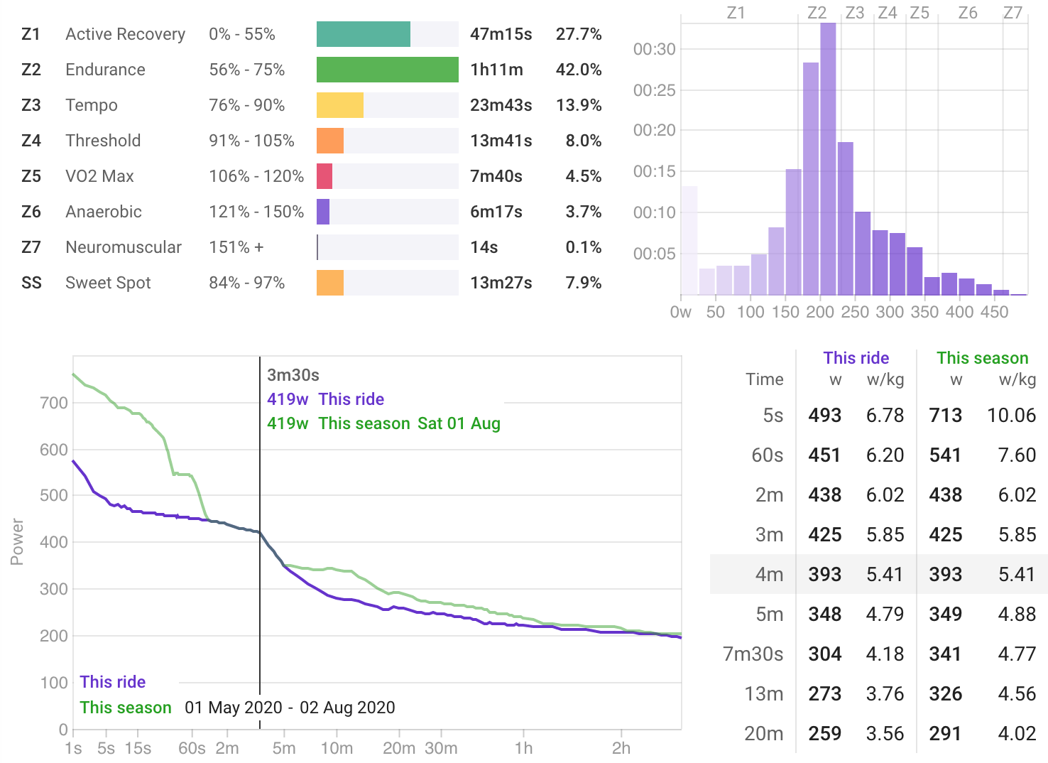
Power Charts
Analyze zone time distribution, view your 42-day power curve, histograms, and best efforts all within the context of a single activity.
Learn more →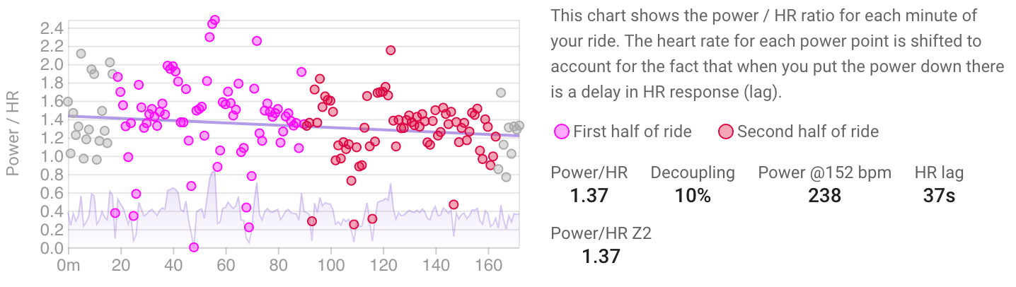
Decoupling
Track your aerobic fitness through cardiac drift analysis. The Power/HR Z2 metric provides a clear picture of your aerobic efficiency over time.
Learn more →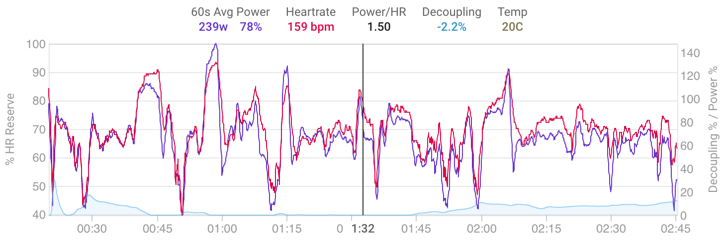
Seiler Decoupling
Analyze decoupling using 60-second moving averages with power and heart rate expressed as a percentage of reserve, inspired by Dr Stephen Seiler's research.
Learn more →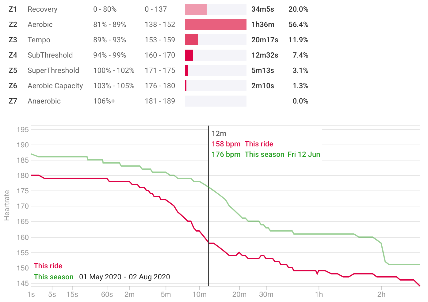
Heart Rate Charts
View heart rate zone time distribution and duration curves to understand the cardiovascular demands of your activities.
Learn more →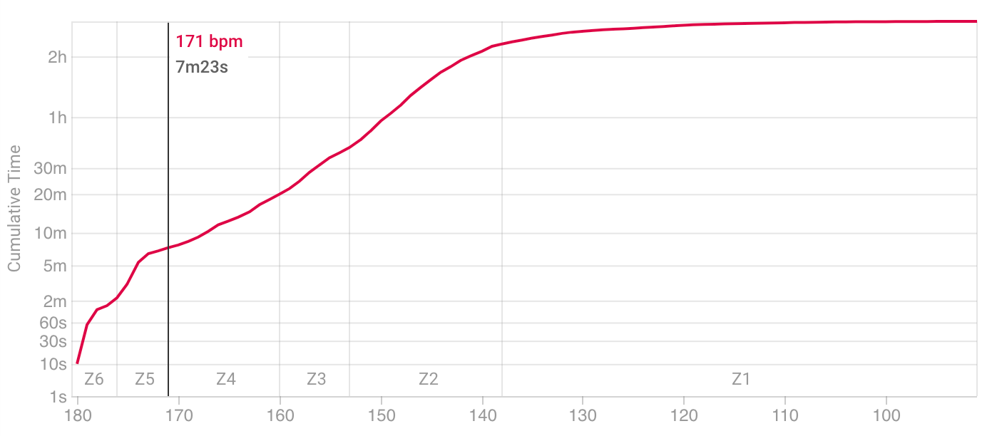
Cumulative HR
Visualize cumulative time spent at heart rate levels. Useful to check that your VO2 max intervals are achieving sufficient time at high heart rates.
Learn more →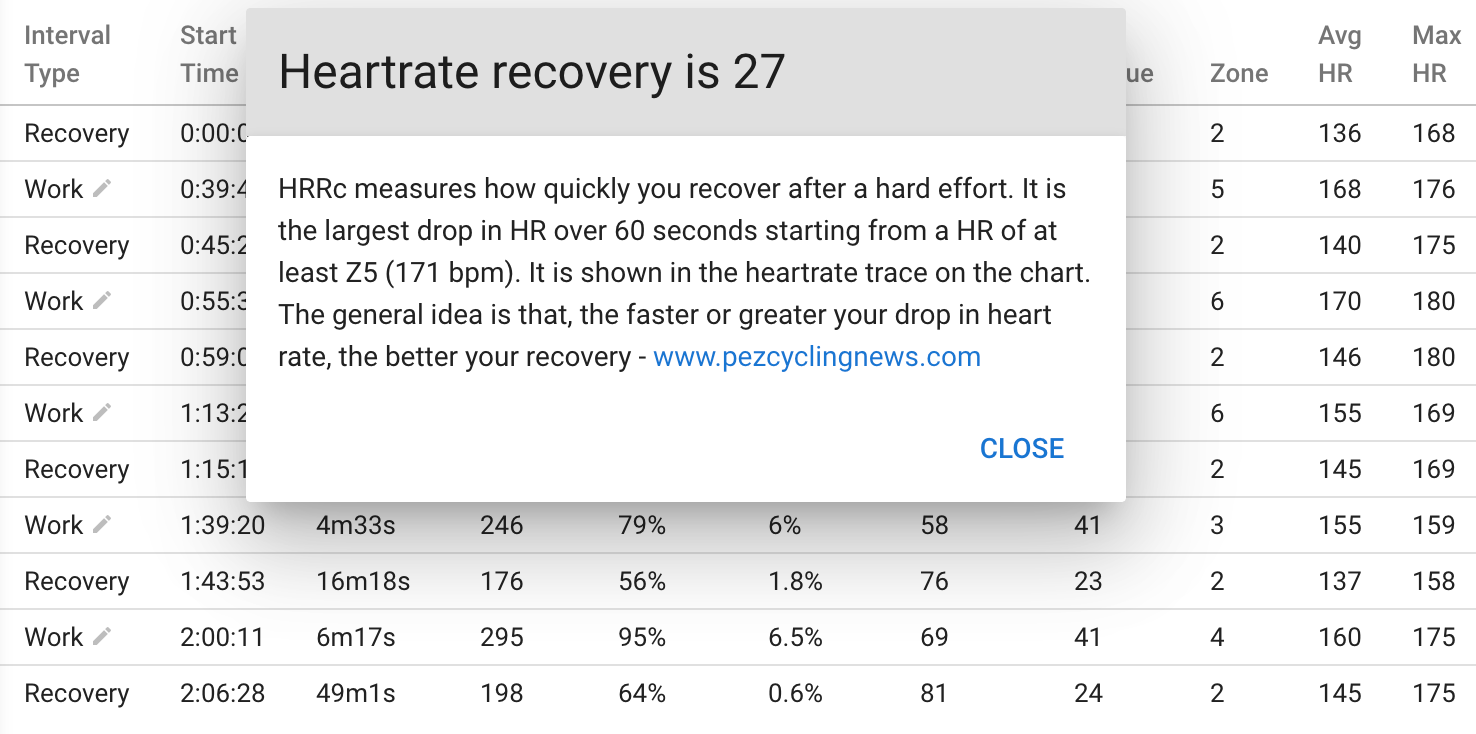
Intervals Table
View detailed metrics for every detected interval in a data table. Export to CSV for further analysis. Popup help tooltips explain each metric.
Learn more →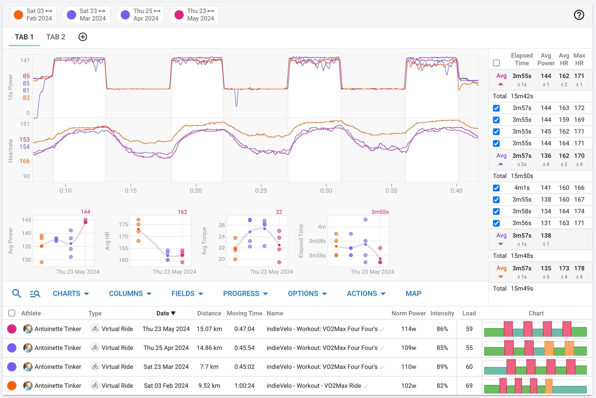
Compare Activities
Overlay activities on top of each other to track progression of interval sessions, compare different athletes, and analyze performance changes over time.
Learn more →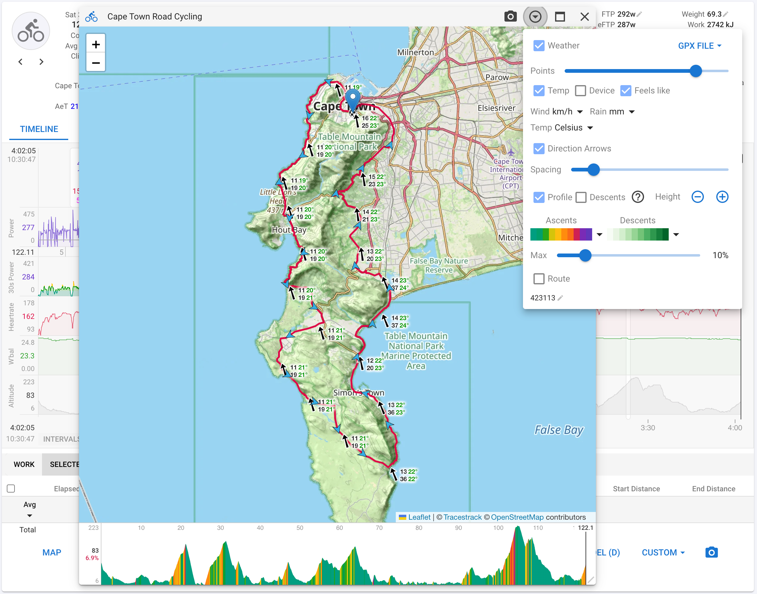
Map & Weather
View your activities on an interactive map with historical weather data overlaid on the route. See wind direction and speed, precipitation, and temperature along your ride or run.
Learn more →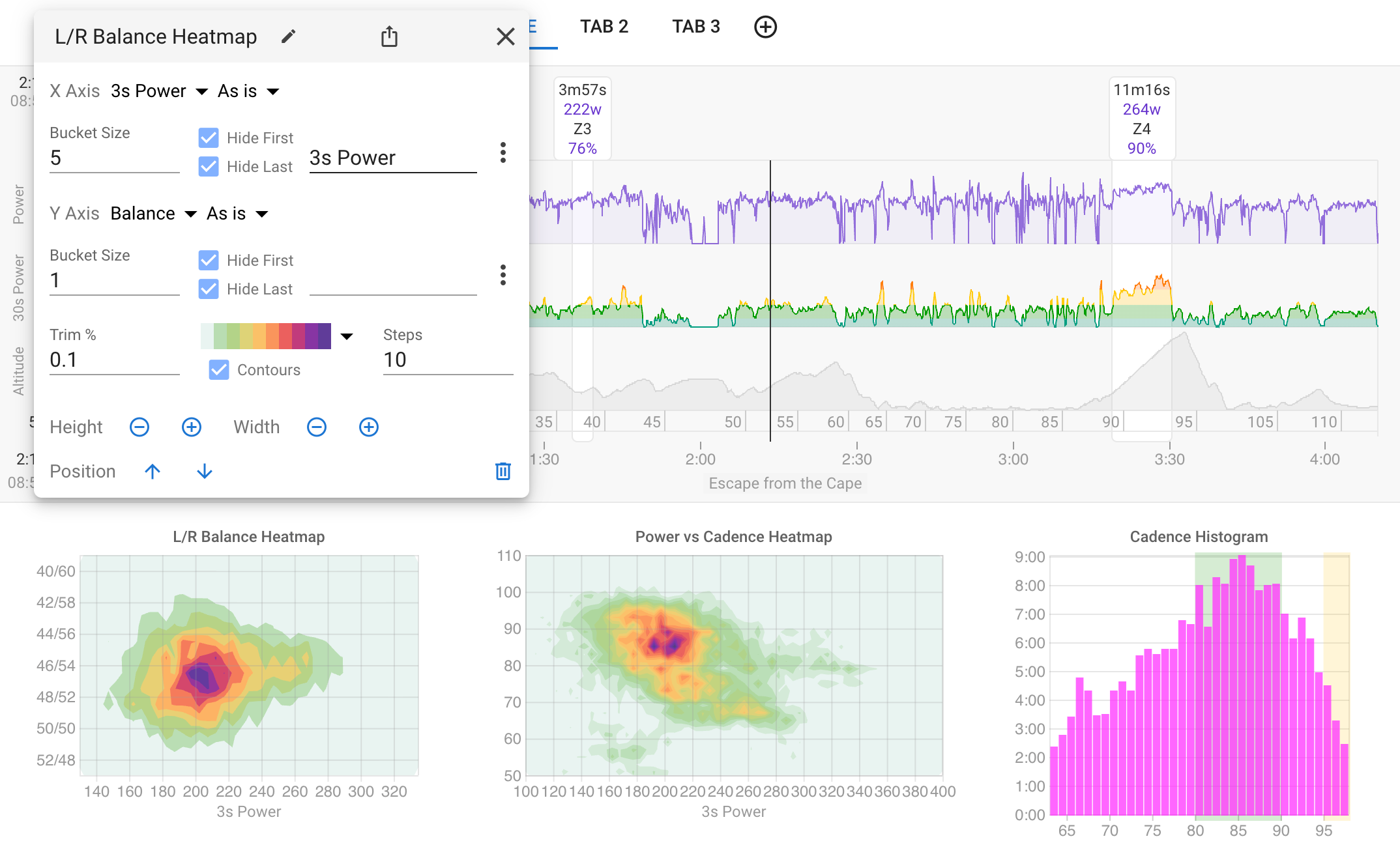
Heatmaps
Visualize activity data density with heatmaps and histograms. Pick any two streams for the axes, set bucket sizes, and see where you spend the most time. No coding required.
Learn more →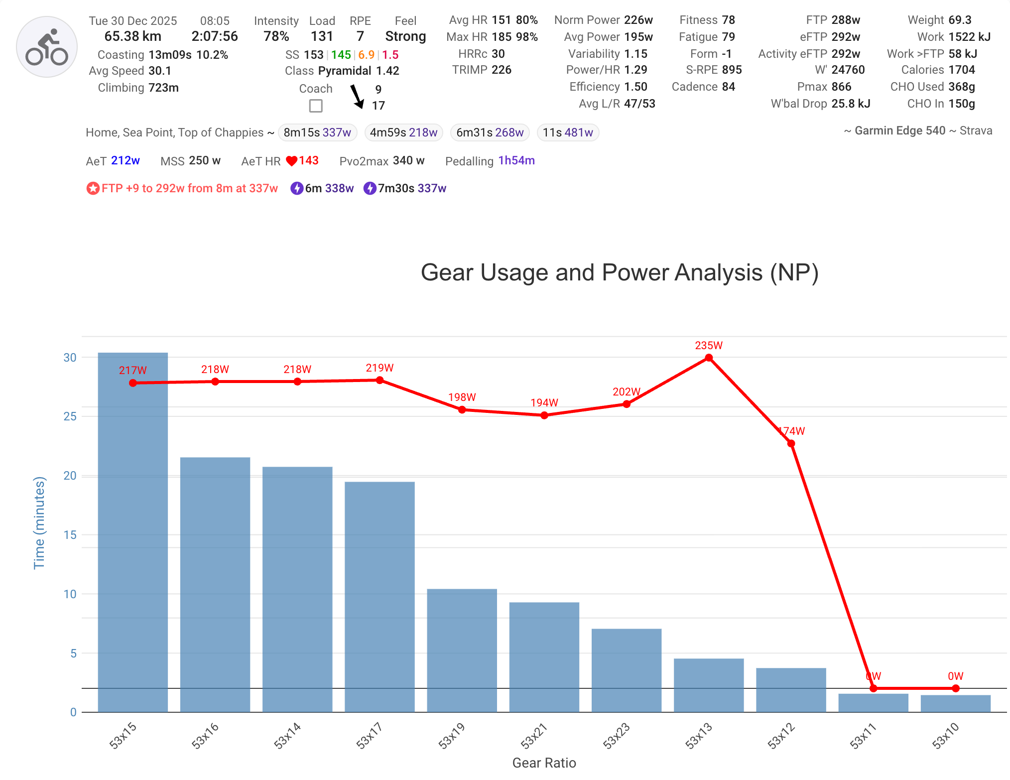
Custom Activity Charts
Create your own activity charts using JavaScript and Plotly. Access power, heart rate, pace, streams, intervals, power curves and more. Share your charts with the community.
Learn more →